
A distinctive brand identity and website for an independent people consultancy, balancing established expertise with fresh energy.
Consulting often comes with a reputation for being complex and a bit distant, wrapped in cold, corporate visuals. This brand identity was designed to change that. The goal was to create a brand identity that shows deep expertise and strategic strength while still feeling warm and approachable. To create the kind of presence that builds trust and lasting relationships. The result is a clear, simple identity that makes complex challenges feel understandable and actionable.
The identity needed to balance four attributes: established and smart, warm and approachable, energetic, and agile. The resulting system pairs a simple, versatile logo with a distinctive color palette, creating a brand that feels credible without being conventional.
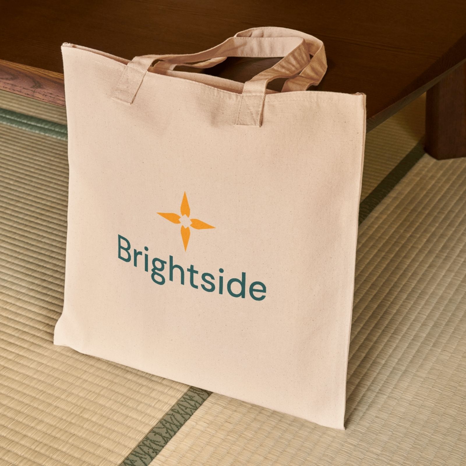
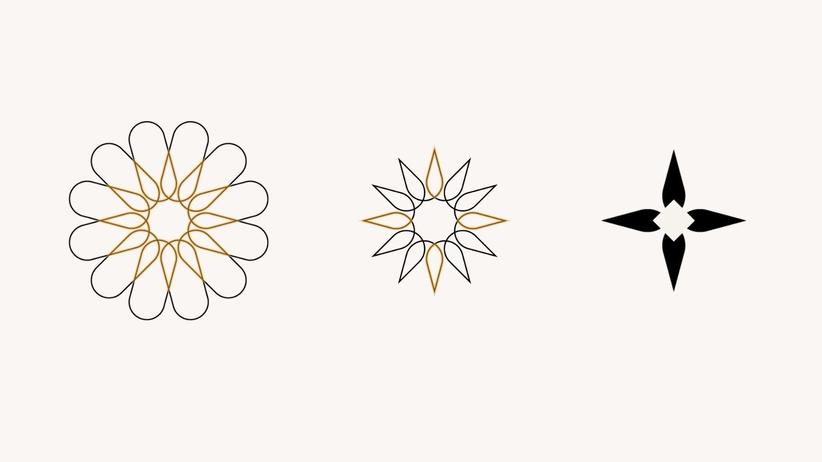
The logomark began with twelve overlapping forms representing the interconnected roles and functions within an organization. At their intersection, a starburst emerges, symbolizing the clarity and alignment Brightside helps its clients achieve.
Simplified into a four-point mark, the symbol reads as both a star and a compass. It connects naturally to the Brightside name while suggesting guidance, momentum, and a clear direction forward.
Deep teal establishes a sense of trust and expertise, while vibrant orange introduces warmth and energy. Clean typography and restrained graphic elements give the identity room to adapt across applications.
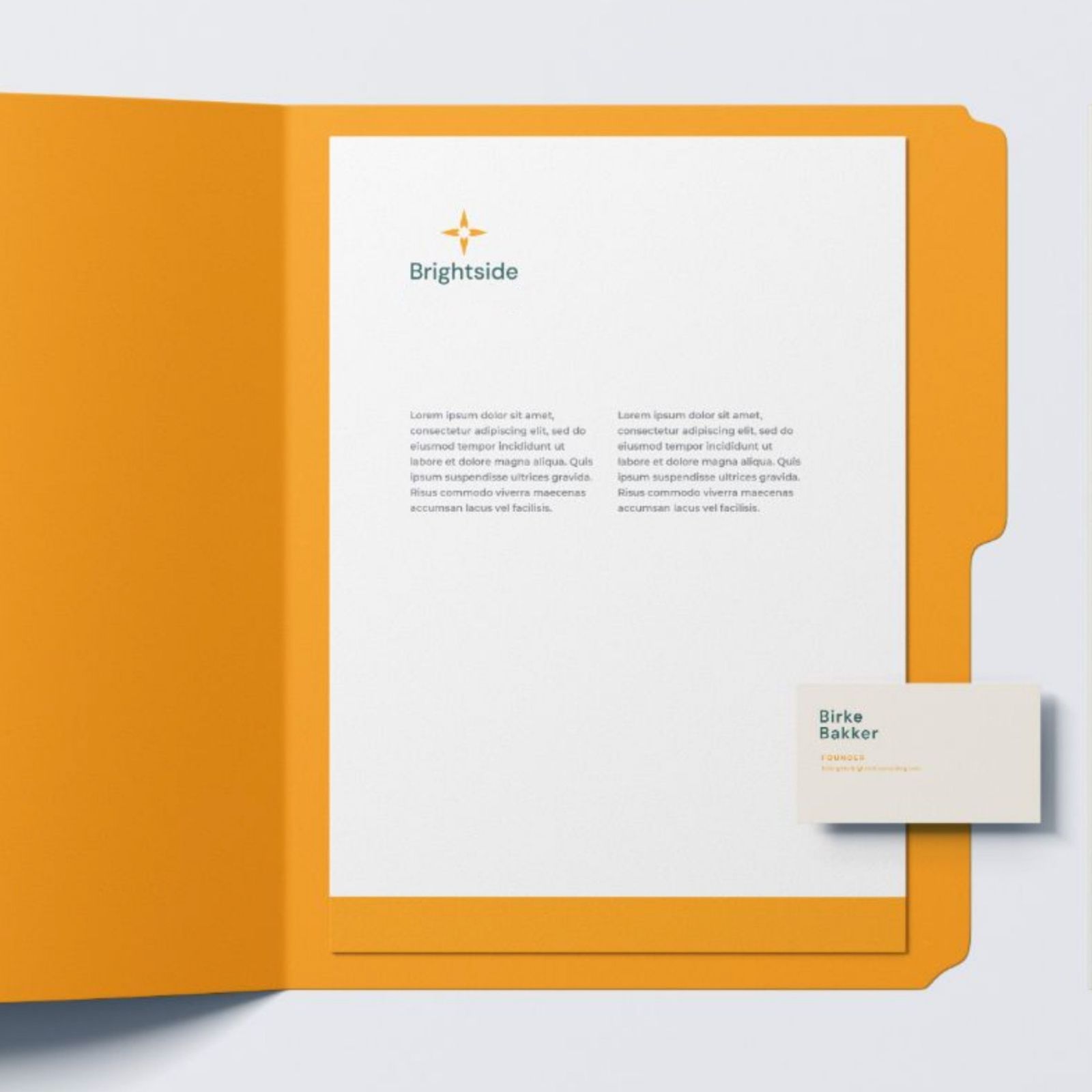
The system includes horizontal and stacked logos, a standalone symbol, and guidelines for consistent use across digital and printed materials.



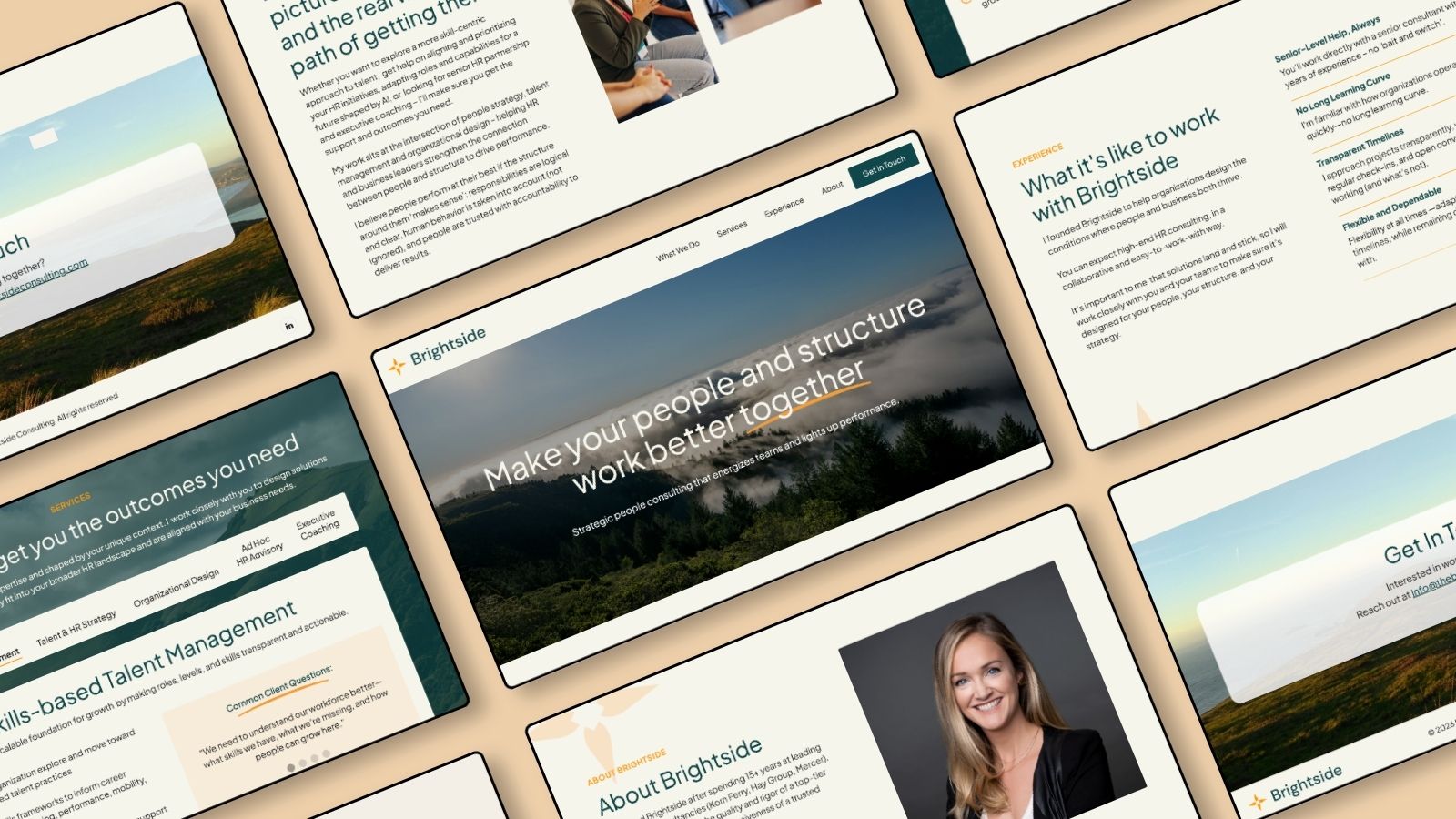
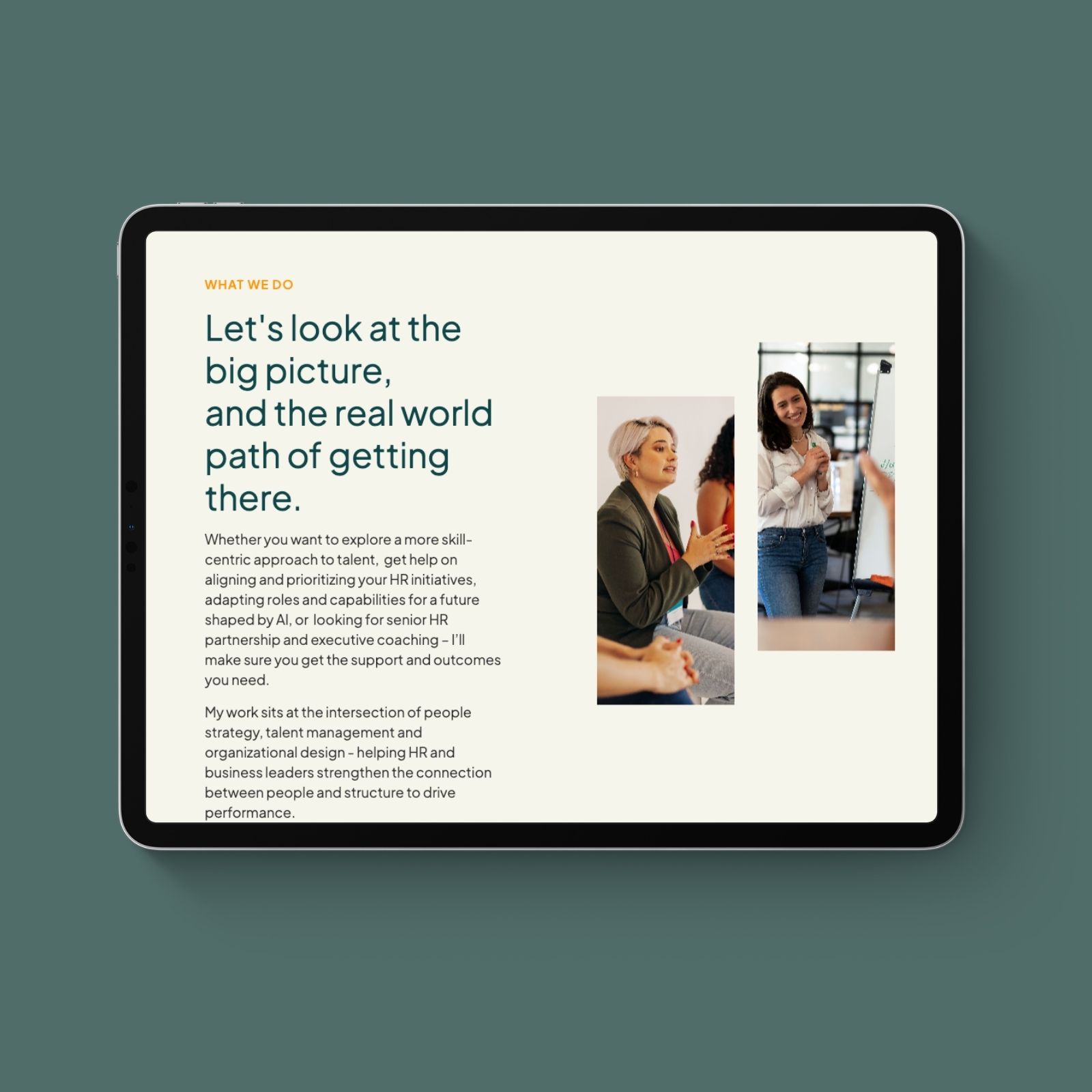
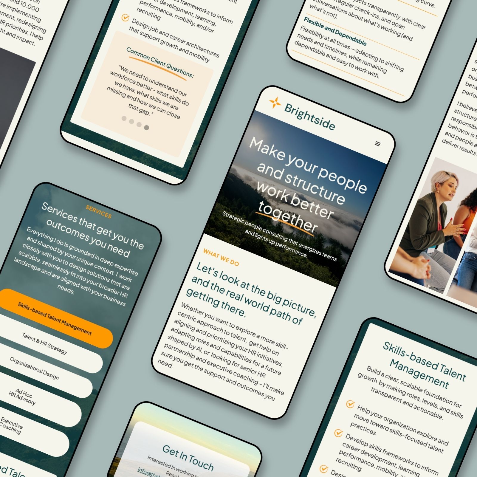
The website translates the new identity into a professional online presence, giving prospective clients a clear understanding of Brightside's expertise, services, and approach to consulting.
Brightside works across interconnected areas of people strategy, from skills-based talent management to organizational design and executive coaching. The website organizes these offerings into distinct sections, pairing each service with practical examples of the challenges clients face.
This approach helps visitors recognize their own needs within the services while making specialized consulting work easier to understand.
The design balances Brightside's senior-level expertise with the accessibility of working directly with an independent consultant. Clear typography, generous spacing, and purposeful use of color keep the experience polished and approachable.
The result is a cohesive brand and digital presence that reflects Brightside's positioning: high-level strategic expertise delivered with the agility, responsiveness, and personal attention of a smaller practice.